The Science Behind Website Design: Where to Position Your Book Now Button to Boost Clicks
Much research has been done into how people read webpages. There is, in fact, a science to it; a certain pattern our eyes follow when we visit a website. Understanding how people read your website is important to its layout, and can be used to your advantage to lead visitors further down the booking path. In particular, the position of your call to action, or Book Now button, on your homepage can be strategically positioned to drive more clicks.
In this article, we examine two concepts, the F-Pattern and Z-Pattern, to understand the most valuable on-screen real estate of your homepage, and where you should position your call-to-actions.
Ushering Website Visitors Down the Booking Path
When someone visits your website, you don’t always know what their intention is. They may be a new visitor researching your property for the first time. Or they may be a returning visitor who is ready to book. Either way, your ultimate goal is to get them to your booking engine.
To do this, you need a well-thought navigation plan from your homepage; one that leads new visitors down the booking path, and feeds them all the right information along the way, so that they feel comfortable making a reservation at the end.
However, for returning visitors who are ready to book, it’s important to give them a way to fast track this navigation path, and get to the booking engine quickly. A clear and well-positioned call to action on your homepage can increase conversion rates. However, where you position this call to action depends on the type of website or webpage you have.
The F-Pattern
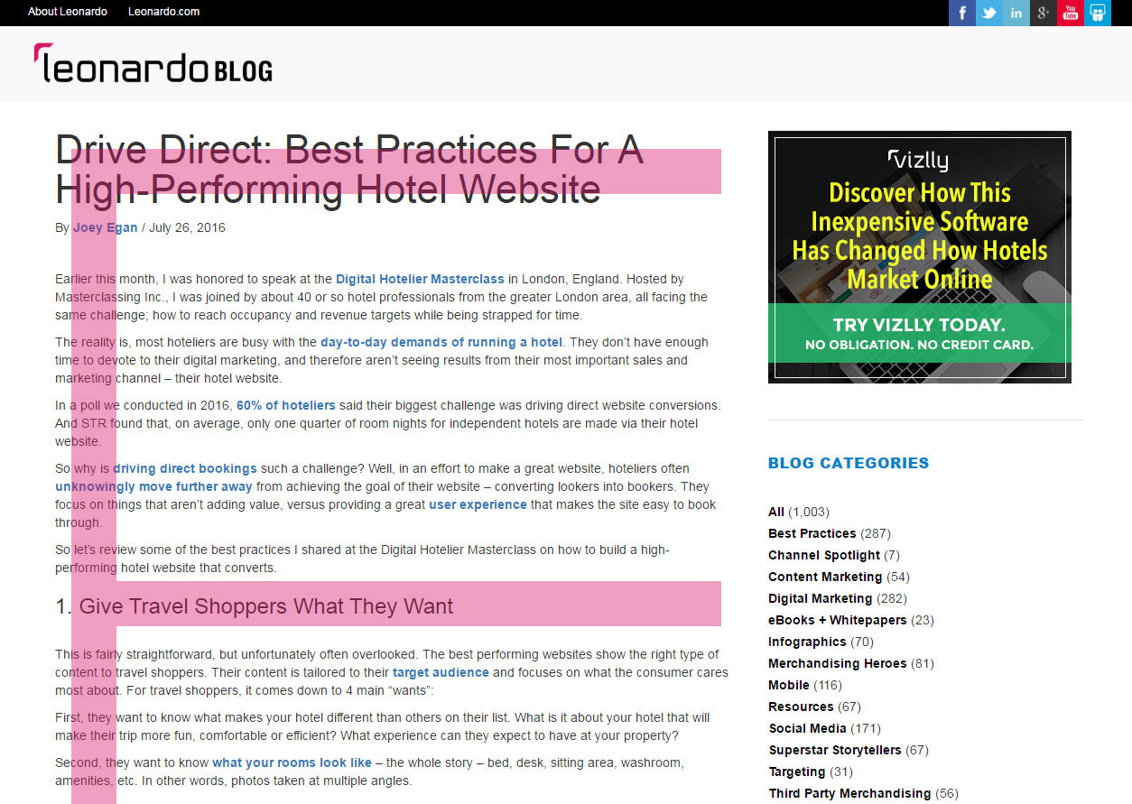
A 2006 eye tracking study by Jakob Nielsen found that we, as humans, read text-heavy webpages, like news sites and blogs, in much the same way. This is largely based on the fact that in Western culture, our reading pattern is left to right. So on a website, visitors will first read from left to right across the top of the page, typically where the header is located. They then scan down the left side of the page, looking for interesting headings or keywords that stand out. Once they have found something of interest they read across the page again from left to right, completing an F shape.

You can see from this previous blog post how people read text-heavy webpages in an F-pattern.
So what does this mean for your hotel website?
Well, if you have a text-heavy website, or a blog attached to your website, try to include a clearly named navigation bar across the top of your homepage. This is where people are going to look first. Another good position for important information, like your call-to action, is to the left, because that’s where the eye is naturally drawn.
The Z-Pattern
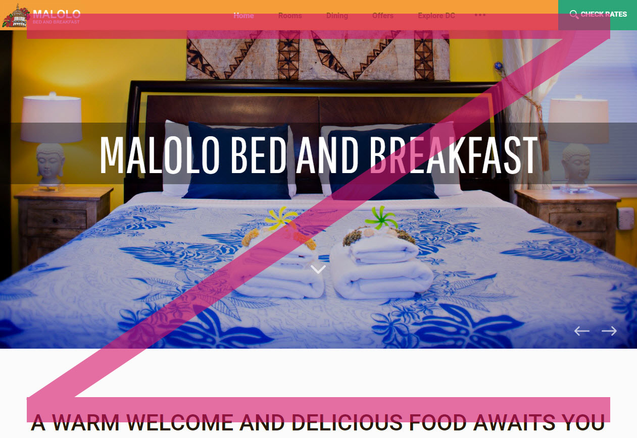
If your hotel website is more visually driven, then pay attention to the Z-pattern. Like the F-pattern, the Z-Pattern gets its name from the eye movement we typically follow on a webpage. The Z Pattern brings order to simpler, more visual webpage layouts. Visitors will first read horizontally across the top of the page, looking for important information in the header. When the eye reaches the end, it shoots down to the left and repeats, making a Z pattern.

The Malolo B&B takes advantage of the Z-pattern, placing their book now button in the top right corner.
What does this mean for your hotel website?
If your homepage includes a slider of images, or something highly visual toward the top of the page (which we hope it does), then pay attention to the Z-pattern. A great place to position your call to action following the Z-pattern would be the top right, or a little further down the page on the right.
What Call to Actions to Include
Now that you know where to position your call to action, it’s time to decide what call to actions to include. While a link to your booking engine should be the main call to action on your homepage, it’s also important to cater to people who may prefer to book another way. Make your phone number or email address highly visible on your homepage too. This is especially important on mobile devices. Make it easy for hotel shoppers to get in touch. Ensure your phone number has click to call functionality, or a hyperlinked email address that quickly launches a new email.
A different call to action may make more sense on other pages of your website. For example, if your hotel hosts weddings and you have a dedicated page for this, a more appropriate call to action might be to “Contact a Wedding Planner” or “Request a Wedding Package.” Make sure your call to actions make sense for each page of your website and are tailored accordingly.
Best Practices for Call to Action Buttons
In summary, you don’t always know why people are coming to your website, but that doesn’t mean you should include everything all at once on your homepage. Instead of trying to cater to everyone, keep it clean and simple, with one clear call to action. Remove anything that distracts viewers from making it to your booking engine or getting in touch.
Where you position your call to action can affect click throughs. It’s best to cater to our human conditioning and the way we read webpages. If your homepage is very text rich, we suggest following the F-pattern and positioning your call to action on the left of the page. If your homepage is visually driven (which we recommend), follow the Z-pattern and position your call to action in the top right of your homepage.
Get more strategies for your hotel website
Get more digital marketing tips for your hotel website. See our 5 content marketing best practices to drive more direct bookings. Watch the quick video here.

