What a Great Mobile Website Looks Like for Hotels
Last year, for the first time ever, mobile internet usage surpassed desktop. People aren’t just using their phones to scroll through Facebook, or read articles like this one. A large portion of them are using smartphones to research and book travel.
1 in 5 hotel reservations are now made on a mobile device, and this number is only going to keep growing. Hoteliers can’t bury their heads in the sand any longer. If you want to compete for those bookings, you need a mobile website.
But what exactly is a mobile website, and how is it different from your desktop website? In this article, we outline the features of a great mobile website for hotels, and how to tailor yours to drive more mobile bookings.

What’s Different About A Mobile Website?
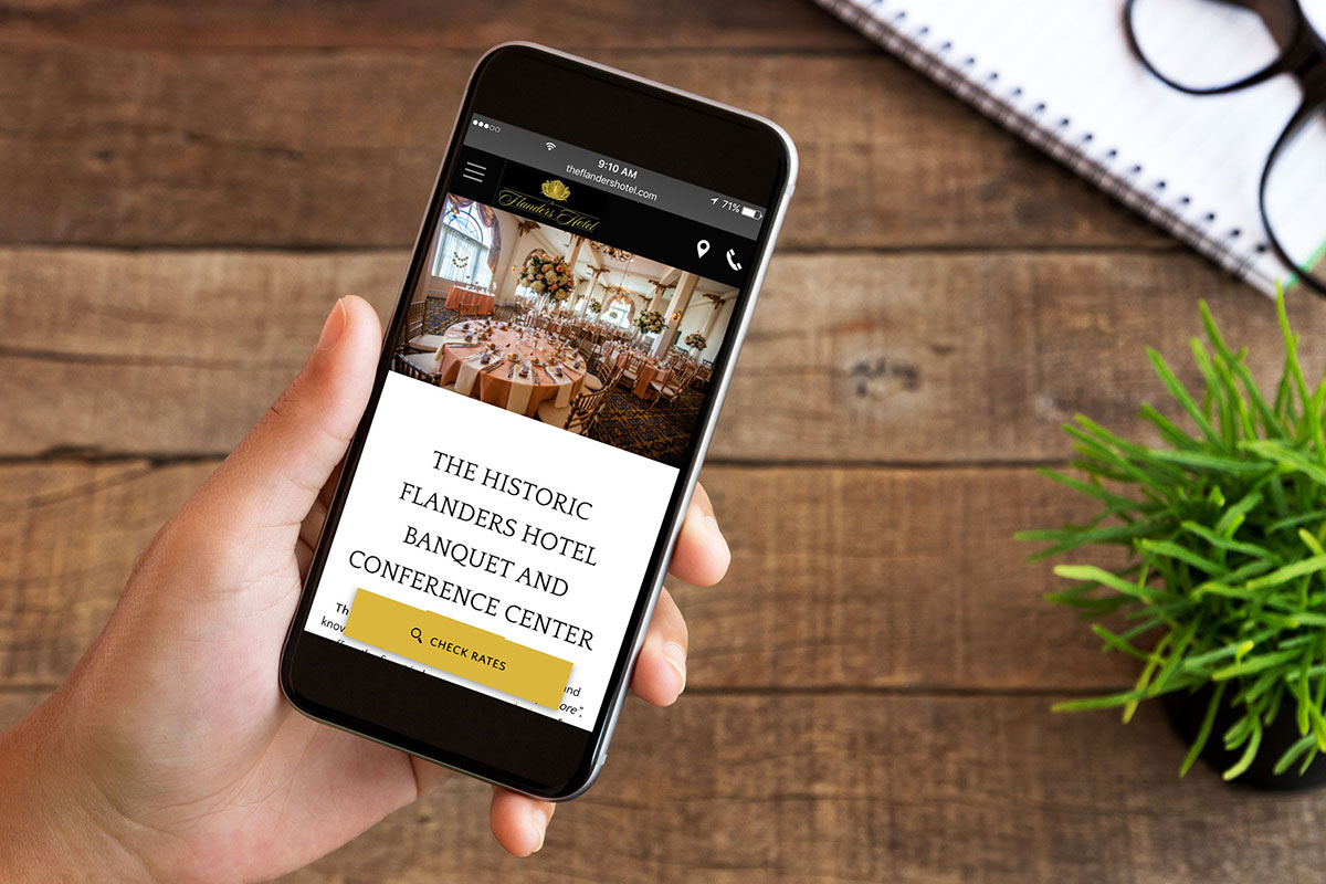
There is a common misperception that a mobile website is simply your desktop website displayed on a mobile device. This is not the case. A mobile website is specially designed for the smaller screen of mobile device, with easy navigation and fast load times so users can find what they’re looking for fast.
In the absence of a mobile website, the desktop version will load on a smartphone. You know you’ve come across a desktop website on mobile when the website is so tiny that you need to pinch the screen and zoom in just to be able to read anything. This creates a horrible user experience and won’t drive direct bookings. People’s patience for a cumbersome or clumsy mobile site is thin. In fact, 29% of smartphone users will immediately switch to another site if it doesn’t satisfy their needs (e.g. they can’t find information or it’s too slow).
What Should Your Mobile Website Look Like?
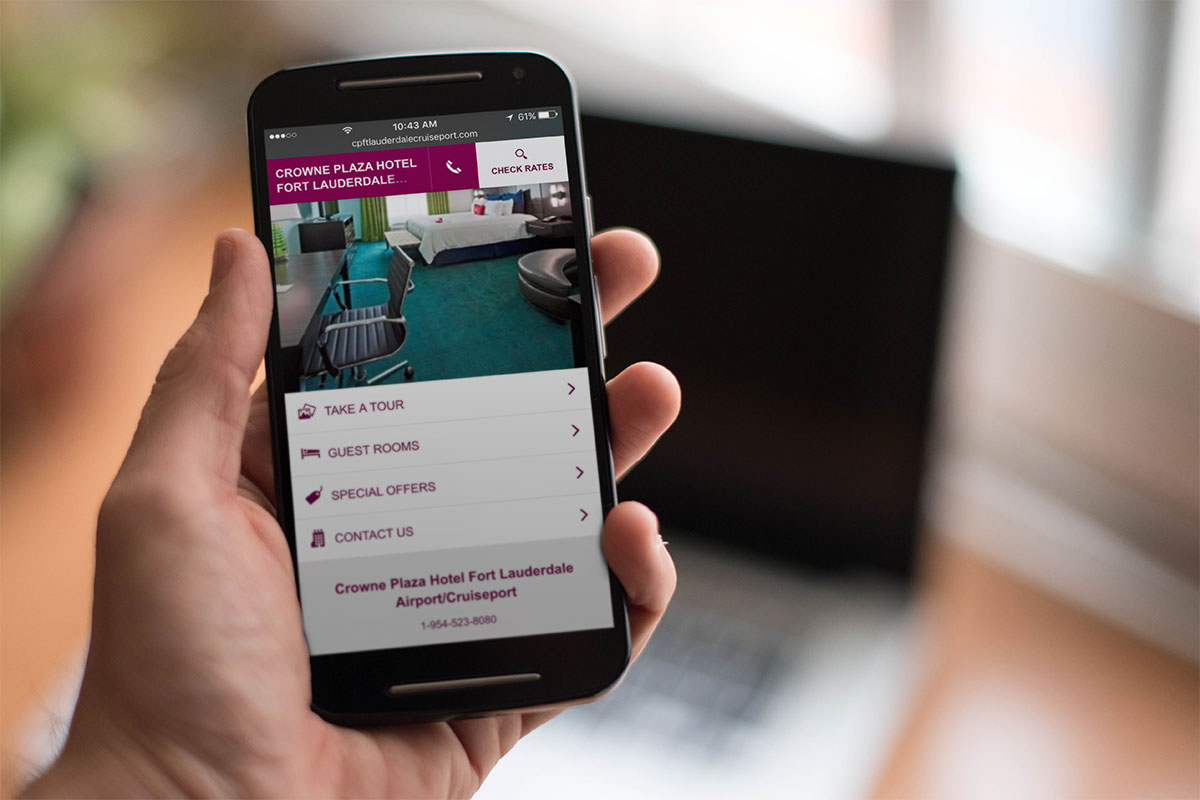
Mobile websites primarily come in two different formats: Responsive and Optimized.
A responsive website responds to the device that is being used to view it. It’s the same website, just loaded differently depending on the mobile device. This is a good option if you want your website to be consistent across desktop and mobile.
An optimized website, on the other hand, is a completely separate website from your desktop version. It can still contain a lot of the same information, but can be customized for mobile visitors. For example, you can create targeted content or special offers for people on-the-go.
One type of mobile website is not better than the other. It all depends on your property and your preference. That’s why Vizlly provides you with both options.
Google doesn’t mind which version you use either. It simply wants your mobile website to improve the user experience on a mobile device. To achieve this, Google makes the following suggestions:
- Content should be the right size to fit on a mobile screen. Users shouldn’t have to zoom or scroll across to view the content
- Text should be large enough to be easily read without zooming
- Links should be placed far enough apart that you can easily select the right one
- Avoid software that is incompatible on mobile devices. E.g. Flash has never been available on iPhones and is not available on newer Android phones – best to avoid it
Vizlly’s mobile website themes adhere to these guidelines and have received Google’s mobile-friendly designation.
Mobile is King in the Eyes of Google
Receiving Google’s mobile-friendly designation is crucial in order to drive organic traffic to your website. In 2015, Google made its first algorithm update that included mobile-friendliness as a ranking signal in mobile searches. That meant websites that weren’t mobile-friendly appeared lower in search results. And last year, Google increased the importance of the ranking signal, pushing websites lower down still.
But the real game changer came in October 2016 when Google announced they would be switching to a mobile first index. You may be asking yourself, “What is a mobile-first-index?” It’s actually quite simple, but has a massive impact on how easily people can find your website in organic search results.
Google gathers information on every website and puts it into a giant index. The index is then used to return the most relevant search results to a search query. In the past, the information collected was from desktop websites. Now, Google is gathering this information from mobile websites, even if the search is done on desktop.
How to Tailor Your Content for Mobile
Since Google will be looking at your mobile website first, it is important that your website includes as much information as possible without impacting load times. To do this, the content on each page of your mobile website should only cover a single subject. Sticking to a single subject not only makes it easier to navigate, but also reduces page size, which improves load times.
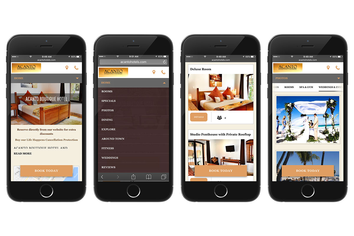
Vizlly makes it easy for you to create mobile webpages targeted at a single subject (e.g. Things to Do, Special Offers, Weddings & Events). Our advanced image processing allows you to upload more images to these pages without impacting load times. And the text editor helps you target specific keywords that will drive more organic traffic.
Special Features of a Mobile Website for Hotels
Hotels should also include the following special features to help visitors on the go:
- Click to call functionality, so hotel shoppers can easily contact your property
- Booking engine integration to support mobile bookings
- Google Maps integration, so travel shoppers can see your location and guests can find their way back to you hotel
- Mobile-specific special offers to encourage direct bookings
- Local insights on things to do and places to eat
It’s Not as Hard As You Think
The thought of building a mobile website can be intimidating, but it doesn’t have to be.
Start by deciding if you want a responsive or optimized site. Then simply follow Google’s guidelines (outlined above) to ensure an easy navigation and quick load times. Populate your website with targeted content that serves mobile visitors out there on the go.
To make it even easier, check out how Vizlly can give you the mobile website of your dreams.

Request A Demo
For more information about Vizlly, request a demo with one of our Vizlly specialists.A Beginner’s Guide to SEO for Hotels
How to Craft Compelling Content on Your Website to Motivate Hotel Shoppers
